Customizing Banner Design
Use the Design tab to set placement, revoke icon behavior, toolbar visibility, duration control, animation, colors, and font sizes. These options shape the banner’s look and movement without touching code.
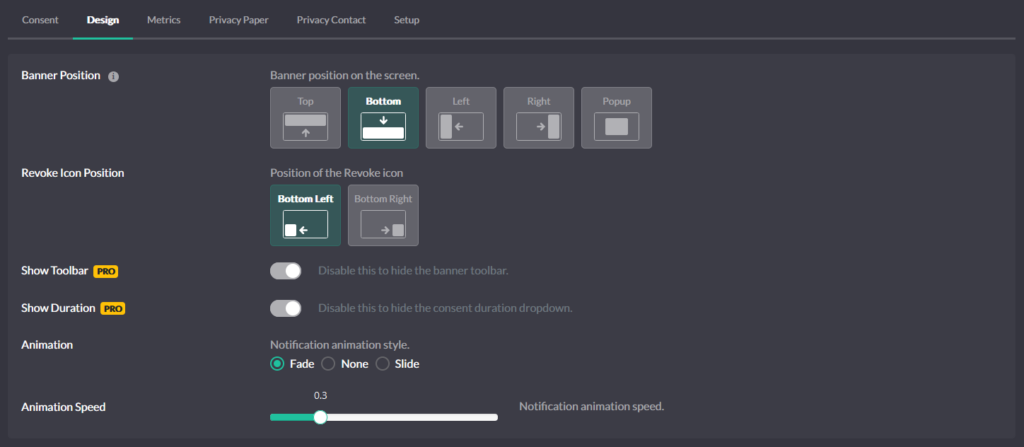
Position (layout on the page)
Choose where the banner appears: Top, Bottom (full-width bars), Left or Right (side tray), or Popup (modal centered on the screen). Pick a position that doesn’t collide with your site header or chat widgets.
Revoke icon placement
Show the fingerprint Revoke icon and place it at Bottom-left or Bottom-right. If you prefer your own control, disable the icon here and wire a custom trigger from the Consent tab.
Toolbar (brand + quick actions)
Toggle Show Toolbar. The toolbar displays the site identity and quick actions like expand and proof-of-consent access. Hide it for ultra-minimal layouts, or keep it to surface trust signals.
Duration selector (visitor-controlled)
Toggle Show Duration to let visitors choose how long their consent should last from the durations you enabled in Consent. If you remove it, the banner still applies your default duration.
Animation (how the banner arrives)
Choose slide or fade and set the speed. Smooth motion draws attention without feeling intrusive; match speed to your site’s UI rhythm.
Colors (brand match and clarity)
Set the palette so the banner fits your brand and remains readable:
- Primary Color – buttons and active elements
- Border Color – outlines and inactive elements
- Level 1 / 2 / 3 Colors – bullets for Private, Balanced, Personalized
- Background – banner background
- Headline – title text
- Text – body copy
-
Button Text – button labels
Aim for strong contrast for accessibility and legibility.
Font sizes (hierarchy and readability)
Adjust Headline and Text sizes so the title leads and copy stays readable on mobile. Keep line lengths comfortable in side trays and popups.